These brand guidelines serve as a structured framework of rules and standards, aimed to ensure consistent representation of the Our Whole Lives brand everywhere it’s displayed. Adhering to these guidelines ensures visual uniformity that reinforces the brand’s aesthetic, purpose, and values.
Download and read the Our Whole Lives Brand Guidelines (DOCX) before creating branded materials, and for evaluating all branded collateral, guaranteeing brand confidence among consumers across various channels.
Here are some of the branding highlights:
Logos, Marks, and Emblem

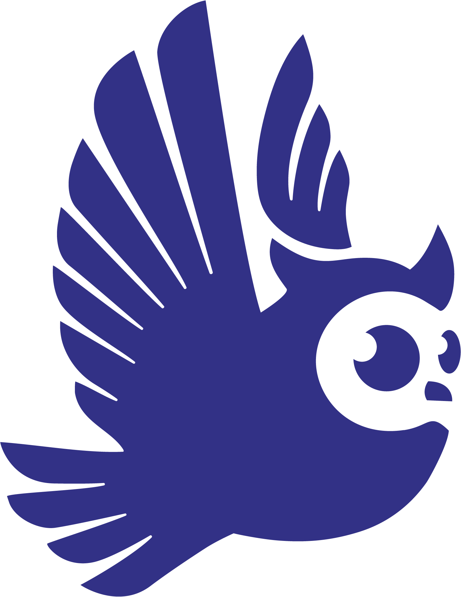
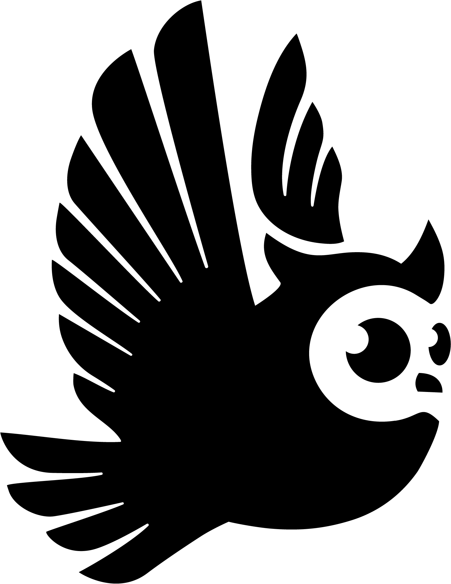
Our Whole Lives Brand Logo
The owl icon serves as the heart of the Our Whole Lives identity, a symbol of wisdom, care, and watchfulness.
Ideal for use in small-scale applications, such as social media avatars, favicons, or embroidery, or as a subtle watermark or graphic accent.
Download the OWL Brand Logo in the following colors:
Our Whole Lives Wordmark
The standalone wordmark offers a simple and flexible typographic treatment of the brand.
Useful in layouts where space is limited or where the icon may be redundant, such as email signatures or footers.
Download the OWL Brand Logo in the following colors:

Our Whole Lives Horizontal Logo & Wordmark
Provides balance and legibility across wide-format uses.
Ideal for website headers, navigation bars, slide footers, signage, or sponsorship layouts.
Download the OWL Brand Horizontal Logo in the following colors:

Our Whole Lives Compact Logo & Wordmark
A clean and cohesive expression of the brand.
This version works beautifully when a strong, centered presence is desired, and it serves well as a primary logo on web, print, and merchandise. It’s especially effective in spaces like the front cover of a brochure, a presentation title slide, or merchandise.
Download the OWL Brand Compact Logo in the following colors:

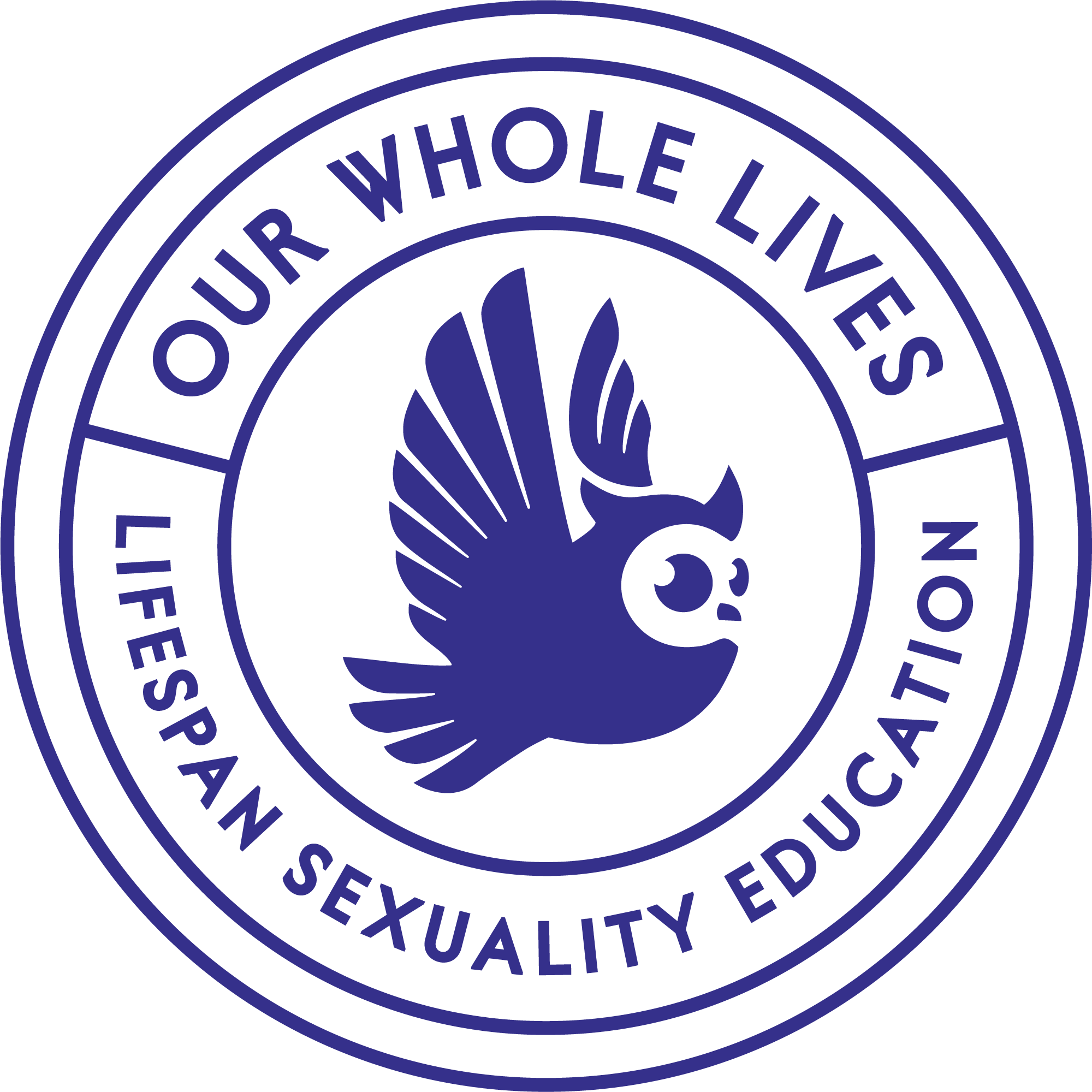
Our Whole Lives Compact Logo, Wordmark & Tagline
Pairs the owl and wordmark with the full program descriptor: “Lifespan Sexuality Education.”
Emphasizes clarity of mission and is well-suited for educational or outreach materials where it’s important to quickly communicate the program’s purpose. It works well in brochures, orientation packets and welcome slides.
Download the OWL Brand Compact Tagline Logo in the following colors:

Our Whole Lives Emblem
This seal-style logo provides a sense of trust, authority, and timelessness, making it especially appropriate for formal or official contexts.
Use this version on certificates, facilitator credentials, letterhead, and any communications that benefit from a sense of endorsement or gravitas.
Download the OWL Brand Emblem in the following colors:
Color Palette

The color palette features a vibrant mix of bright and grounded hues, crafted to inspire a sense of comfort, approachability, and harmony. Each color has been thoughtfully chosen to reflect the warmth, wisdom, and inclusivity at the heart of the program.
The four primary colors (Wisdom, Butter, White, and Shadow) serve as the foundation of the brand, providing contrast and structure for text, logos, and key brand elements. Four secondary colors (orange, red, mist, blue) are available in the Branding Guide above, along with usage with an inverted (light on dark) logo design.
| Color | Hex | RGB | CMYK | |||||
|---|---|---|---|---|---|---|---|---|
| Wisdom Blue | #323186 | 50 | 49 | 134 | 63 | 63 | 0 | 47 |
| Butter | #FFF7D7 | 255 | 247 | 215 | 0 | 3 | 16 | 0 |
| White | #FFFFFF | 255 | 255 | 255 | 0 | 0 | 0 | 0 |
| Shadow Black | #2B2B31 | 43 | 43 | 49 | 12 | 12 | 0 | 81 |
| Orange (Secondary) | #FBB47A | 251 | 180 | 122 | 0 | 28 | 51 | 2 |
| Red (Secondary) | #EE2E5A | 238 | 46 | 90 | 0 | 81 | 62 | 7 |
| Mist (Secondary) | #C5D0CA | 197 | 208 | 202 | 5 | 0 | 3 | 18 |
| Blue (Secondary) | #007EA9 | 0 | 126 | 169 | 100 | 25 | 0 | 34 |
Type (Font)
The type stack establishes a clear hierarchy that ensures consistency across all materials.
Figtree Bold serves as the primary display font, used for headings to convey a sense of clarity. Tenor Sans Regular adds variability and a sense of quiet sophistication to the stack.
For body copy, Figtree Regular creates a seamless reading experience whereas Barlow Condensed Semibold is incorporated for pre-headers and buttons to enhance visual interest and create distinction in high-traffic areas.
See the Branding Guide (above) for more detail.
- Heading & Display: Figtree Bold
- Heading & Accents: Tenor Sans Regular
- Body Copy & Paragraphs: Figtree Regular
- Pre-Headers & Buttons: Barlow Condensed Semibold