Good Web Site Design for Web Site Optimization
Usability Sample
Find links to this article's illustrations.
Private Life in the Castles, the Towns, and the Rural Districts
Augustin Thierry, taking Gregory of Tours, the Merovingian Herodotus, as an authority, thus describes a royal domain under the first royal dynasty of France.
"This dwelling in no way possessed the military aspect of the château of the Middle Ages; it was a large building surrounded with porticos of Roman architecture, sometimes built of carefully polished and sculptured wood, which in no way was wanting in elegance. Around the main body of the building were arranged the dwellings of the officers of the palace, either foreigners or Romans, and those of the chiefs of companies, who, according to Germanic custom, had placed themselves and their warriors under the King, that is to say, under a special engagement of vassalage and fidelity.
Illustrations
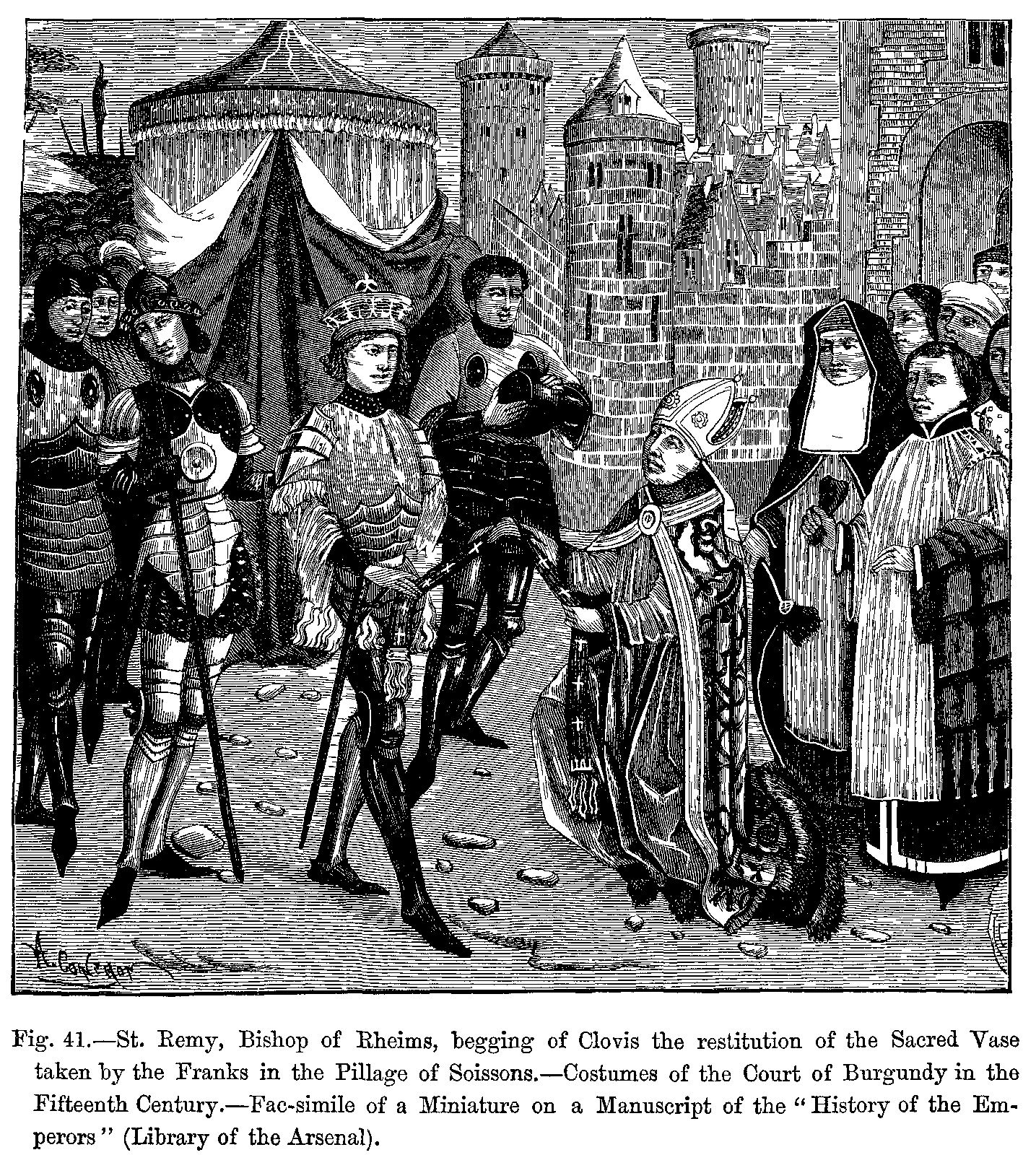
- St. Remy (PNG), Bishop of Rheims
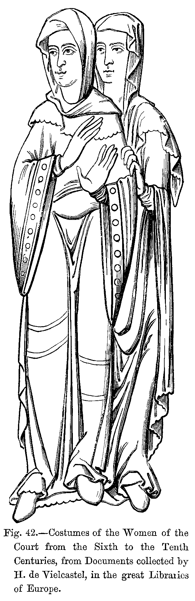
- Costumes of the Women of the Court (PNG)
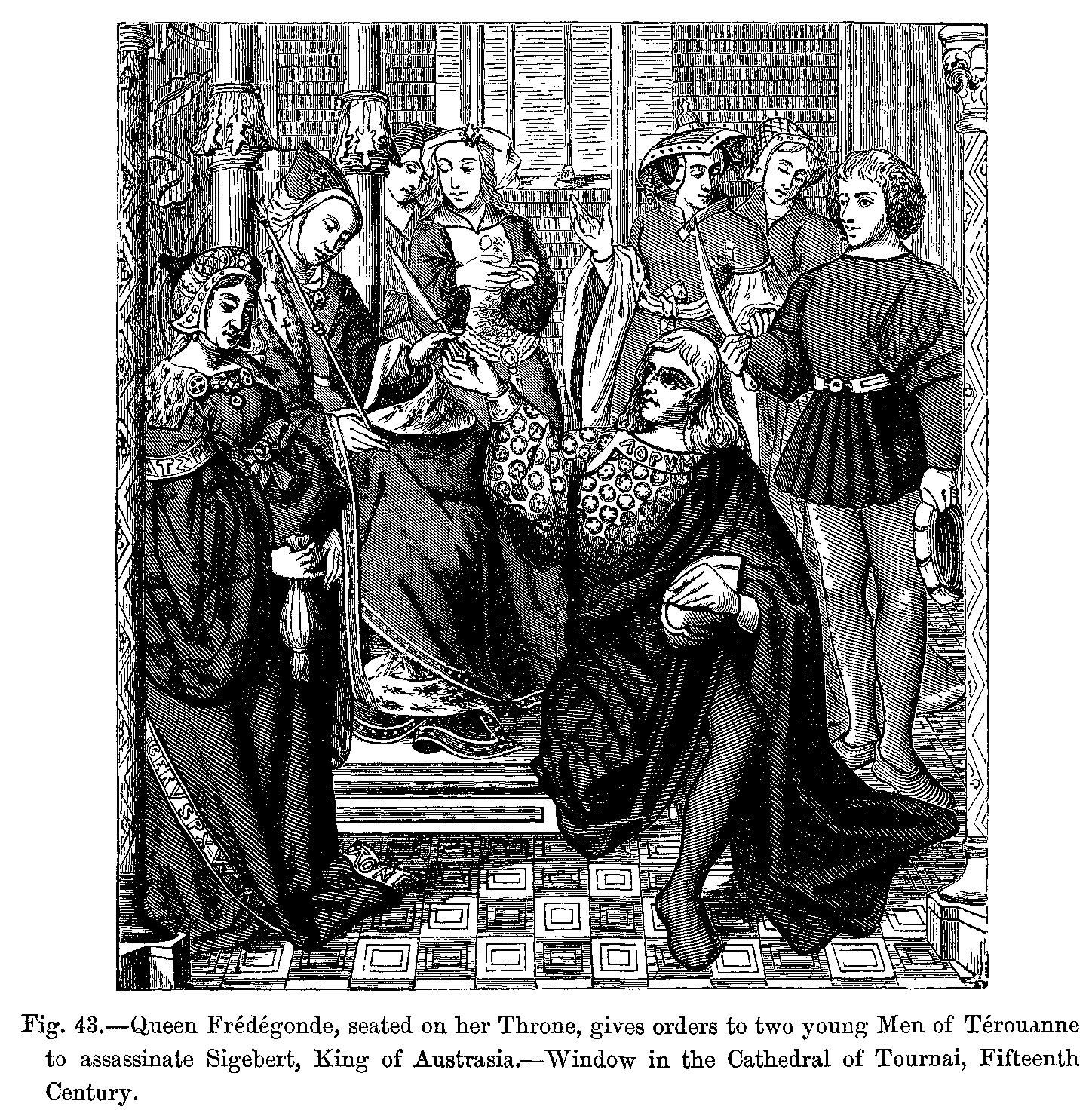
- Queen Frédégonde (PNG)
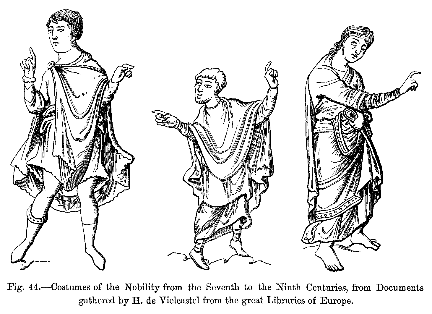
- Costumes of the Nobility (PNG)
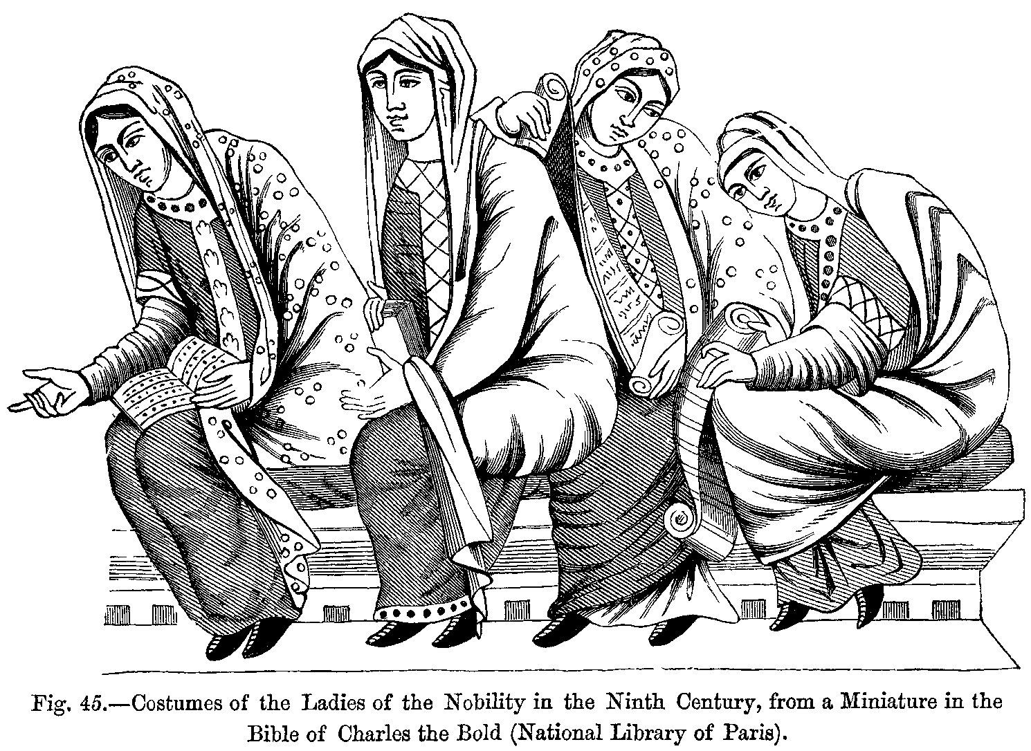
- Costumes of the Ladies of the Nobility (PNG)
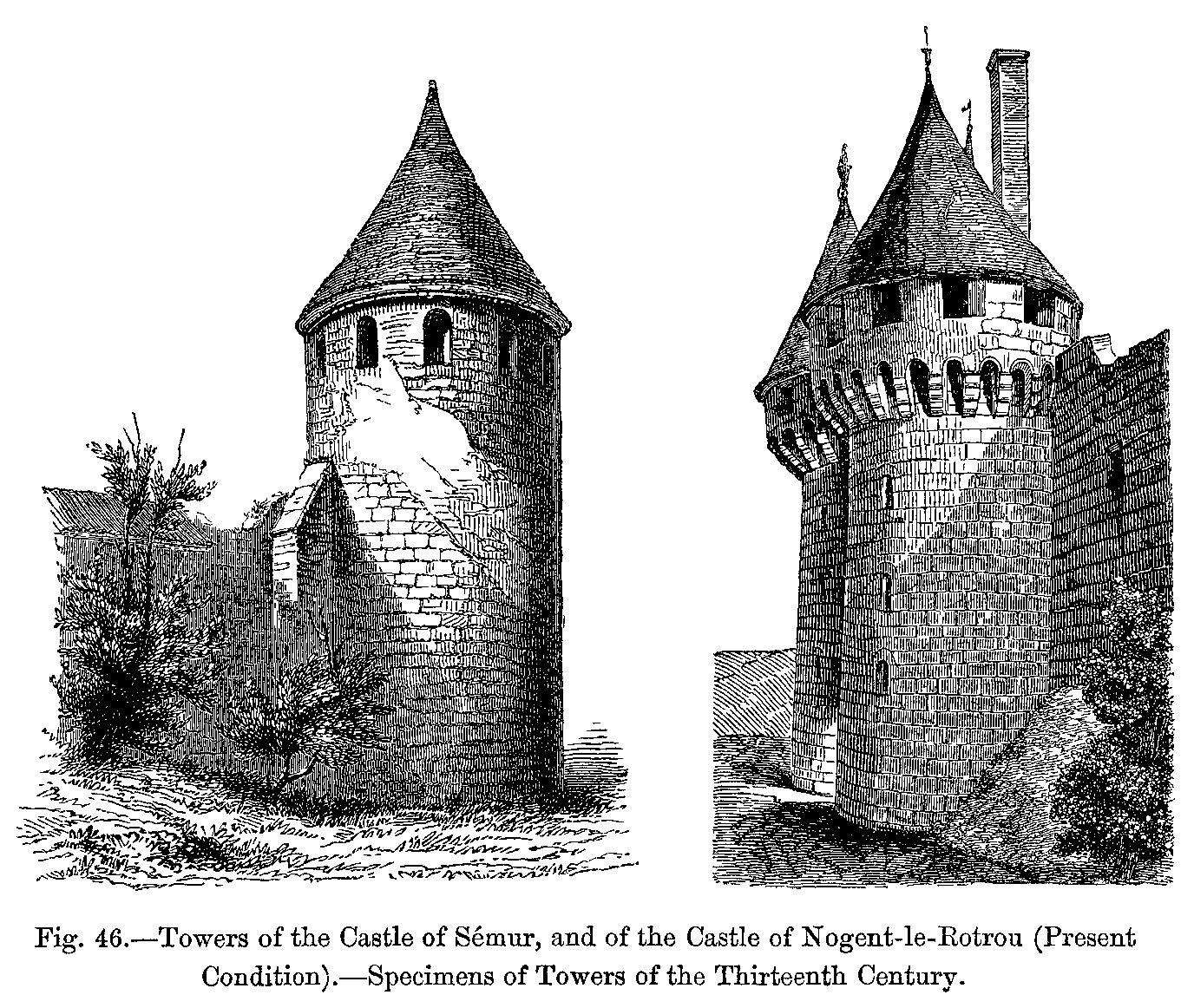
- Towers (PNG) of the Castle of Sémur
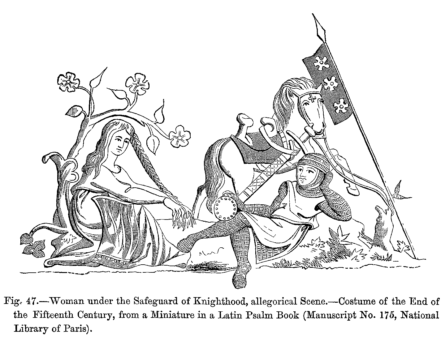
- Woman (PNG) under the Safeguard of Knighthood
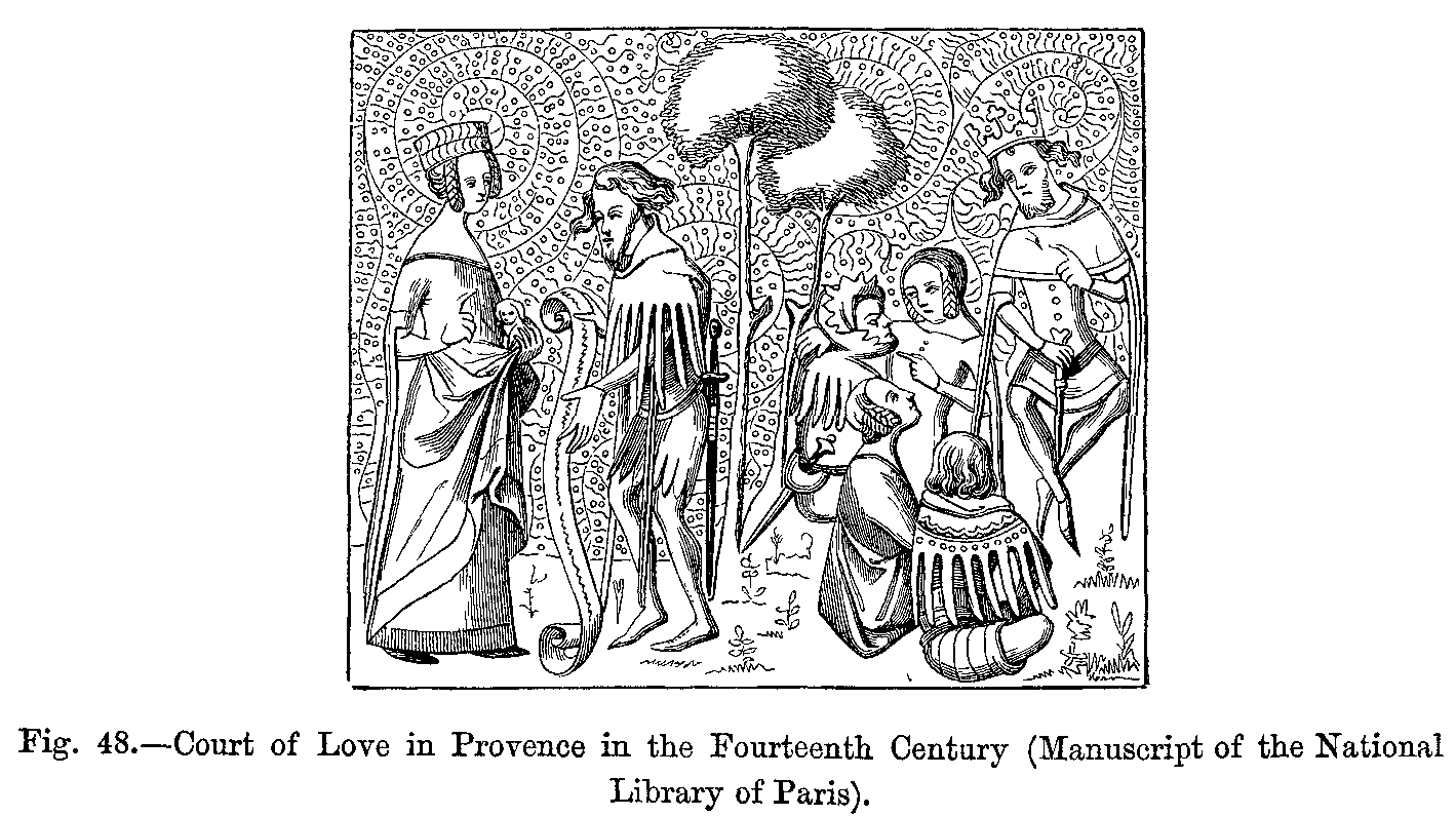
- Court of Love (PNG) in Provence
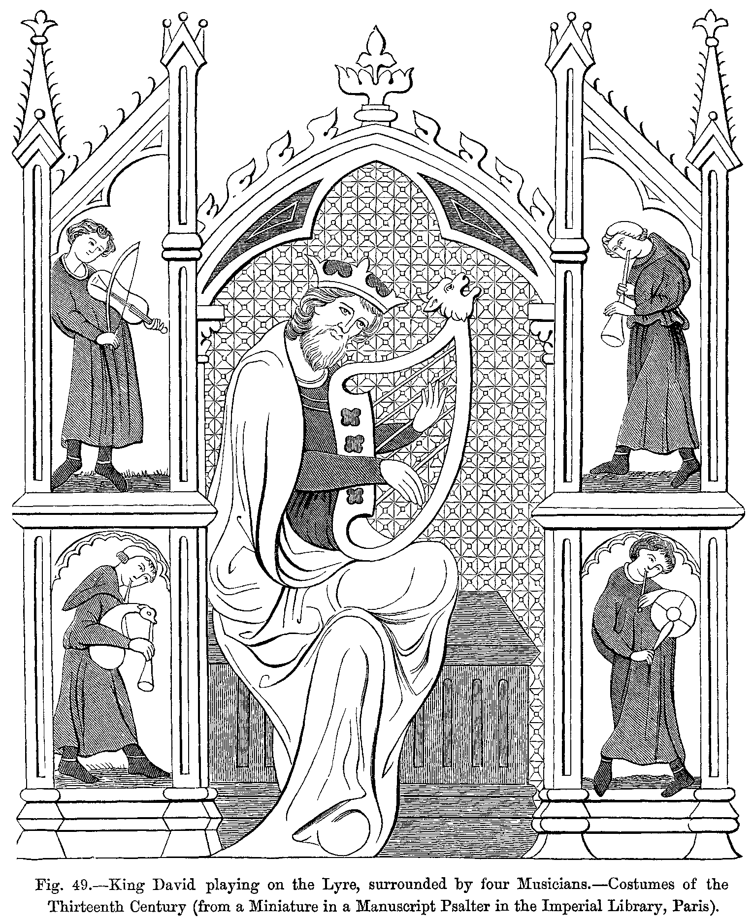
- King David (PNG) playing on the Lyre
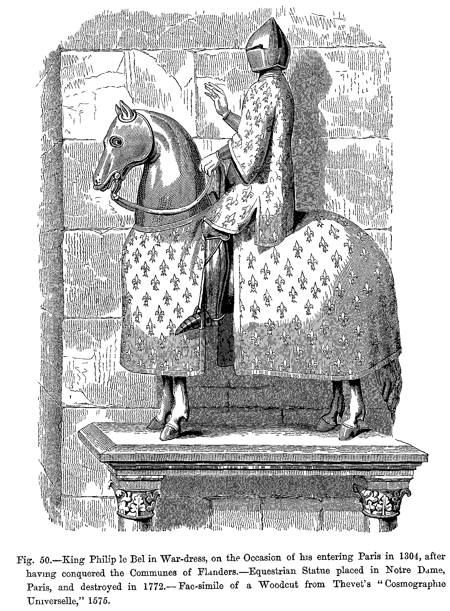
- King Philip le Bel (PNG) in War-dress
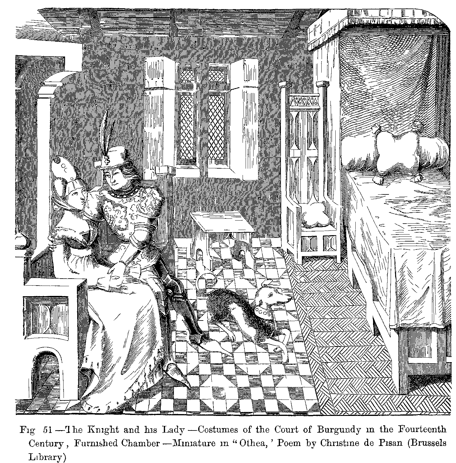
- The Knight and his Lady (PNG)
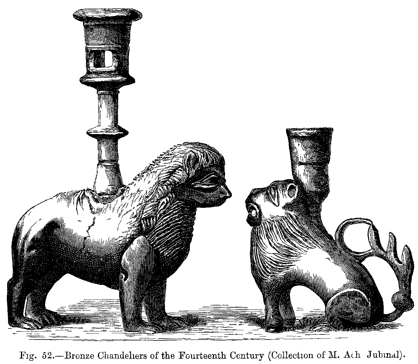
- Bronze Chandeliers (PNG)
Source: The Project Gutenberg EBook of Manners, Custom and Dress During the Middle Ages and During the Renaissance Period, by Paul Lacroix. Modifed to illustrate web usability principles.

Usability Tip
Put important information in the body of your page.
Studies show your material will gain visibility: Readers tend to avoid looking at callout areas that look like ads; instead they focus on the body of a page. Putting your links at the bottom of a page won't cause them to be lost: before a reader leaves a page, they tend to check the bottom for useful content.
Heat maps show that clicks on UUA.org follow the standard that holds across the web: while content in the right sidebar gets some notice, the attention it receives pales in comparison to that given to the classic "F-shape" browsing pattern: Heat Map of a UUA.org Page (PDF).
If you have a lot of material to include, consider moving it to another page entirely, where it's not competing with your main article for attention, and where the shortening of the page and the addition of white space will improve reading comprehension, scannability, and search engine optimization.
Accessibility Alert: The use of columns on a web page arranges content visually for standard web browsers, and organizationally for people using screen readers or non-traditional browsers. Unless hidden links provide alternative page navigation, the columns are read top-to-bottom, left-to-right. On this site, the page content area is offered first, then the image/ related content column, then the site navigation. For all sets of users, your most important content should be placed at or near the top of the page content area.